
An
AIA Continuing Education Program
Credit for this course is 1 AIA/CES Learning Unit Credit.
Couse Number : SET10B
Course Title:
“You are Here”
WAYFINDING THROUGH
SIGNAGE
Credit for this course is 1 AIA/CES Learning Unit Credit.
Couse Number : SET10B
Course Title:
“You are Here”
WAYFINDING THROUGH
SIGNAGE
- You are here! At the theatre, the restaurant, the theme park, at the university, the museum, or the hospital.
- You are here in the airport, the train station or the metro.
- You are shopping, or visiting a resort.
- You are in the natural environment of a park, or on a busy street. Places were once easy to categorize by use and purpose. Now the distinctions are blurring.
- Retail is entertainment. Entertainment may have an educational component.
-
Educational Institutions and entertainment facilities now often incorporate retail.
-
Projects involving transportation, urban planning, tourism, recreation,
retail and identity, utilize signs to communicate with the users
- Public Sector or Private, they are learning from each other how to promote, entertain, market and retail through advertising and signage.
- Colleges, universities and health care facilities, all highly competitive environments are becoming more concerned about image. First impressions to the public have become more important.
- The first part of making a good impression is to guide your visitors through the facility without frustration or even any realization that they have been directed.
- An excellent wayfinding system
is one that the user does not remember seeing, but it got them to their
destination without confusion.
- Wayfinding is the process of introducing a series of instructions which will enable the visitor to find their chosen destination.
- Understanding the traffic flow of the facility will allow an appropriate system to be developed to put the information people need in the proper form and location.
- It is from the first time visitor’s point of view that we approach the act of Wayfinding.
- Limiting the amount of information the user has to simulate at one time will provide a user friendly flow of visitors.
- There are three levels of wayfinding
to navigate when approaching a new destination.
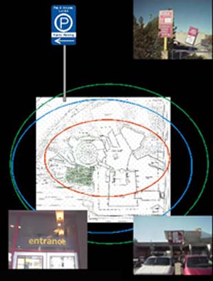
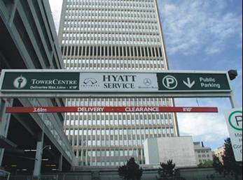
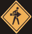
- Trail Blazers - This first level, indicated by the green circle, applies to the signs which direct traffic from the city streets into the facility.
- It takes about 1 city block for a driver to make a decision to turn. Each decision making point needs to be identified with as much notification as the geography will allow. At this level the international parking symbol ( a” P” in a circle) or the facility name with an arrow is all that is required.
- The transition to the next level, indicated by the blue circle, is to provide clearly marked ENTRANCE and EXIT to insure a safe and smooth traffic flow.
- The third level, in red, is at the point
where you Identify the Building by name
or address and clearly identify
the entrance

- Now that you have them on the property you
are in the second level of wayfinding.
The goal is to bring them through the entrance and it's procedures to
the final resting point for their vehicle.

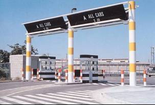
- Following the normal
traffic sign standards and colors promotes familiarity to
international visitors and should be followed when possible.
ie; yellow & black clearance bars.
- One Way, Do Not
Enter
is an important message at an exit point and as such should be in red color indicating caution.

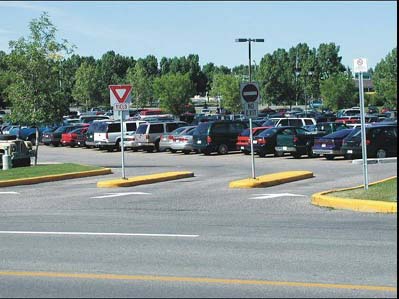
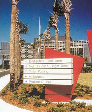
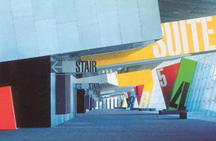
- Now the visitor has parked their vehicle and enter the Third level of wayfinding. Now the messages are being delivered to a person no longer in the car, but a Pedestrian.
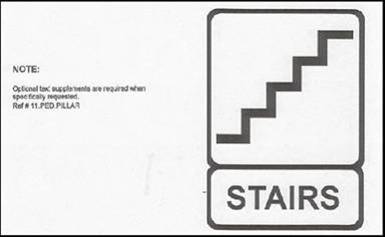
- At this level you must direct them to the
stairs, elevators or walkways leading to/from the facility.

- Secondary messages
such as “No Smoking” or Safety issues are also introduced
at this level
- At street and/or bridge level you must Identify either
a direction,
street name or building name or otherwise provide a link for them
to where they are ultimately going.
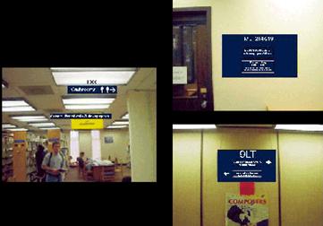
- Once the visitor is inside the facility a planner must consider the practice of Universal Design, which addresses the scope of accessibility and must make all elements & spaces accessible to and usable by all people to the greatest extent possible.
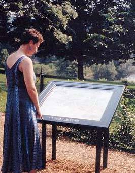
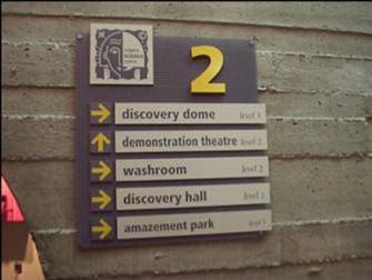
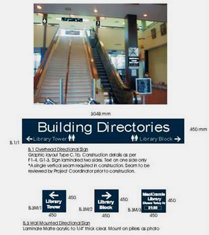
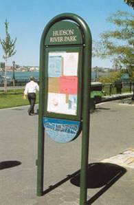
- At or near the entrance a choice of departments or destinations should be listed in the form of a directory or map which is readily accessible
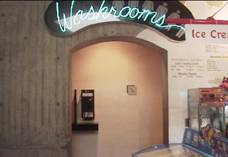
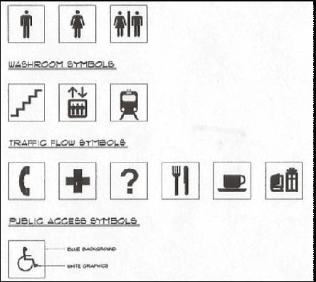
- Identify Public Facilities
such as Washrooms.
- Codes & Bylaws for accessibility may vary and should be checked with the local jurisdiction.
- Mark your destination in a consistent
style to your directional signs.
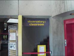
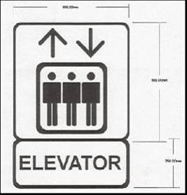
- Any room or destination containing a room number should include either
6” pictograms or graphics raised
1/32” and/or grade
two braille.
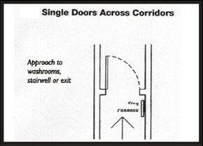
- Signs must be located in order
to allow an individual to approach within 3”
of the sign without obstruction by protruding objects or
opening doors.
- Font size should be between 5/8”
and 2” in height for eye level signs and 3” high for overhead
signs.
- When designing a sign system to serve all of the above criteria, there are a number of things to consider.
- Signs must work with the layout of the building. Hidden corridors
and rooms might require ceiling or wall mounted signs to direct with
added arrows

- The width to height ratio
for letter & numbers on sizes
is between 3:5 and 1:1. - The stroke width to height ratio is between 1:5 and 1:10
- San serif letters are better for use in directional signage
- Non glare materials and finished should be used for partially sited people.
- With normal or corrected sight the viewing
distance is 50 feet for each 1” of letter
height
- ALL UPPERCASE TEXT USED IN AN INFORMATIONAL SIGN WITH A LOT OF INFORMATION
- is much more difficult to read than if you
use upper and lower case

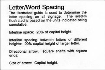
- Font and line spacing should be considered for legibility.
- Kerning is a term that is used to define the spacing between the letters. This is determined and automatically adjusted by computers. For example there would be more space created between an “I” and an “L” than between “W” and an “A” to compensate for the visual space created by the nature of the characters involved.
- Creative license sometimes causes a graphic
designer to adjust kerning and line spacing for affect or shape suitability.
- In a commercial workplace there are often many messages
to deliver to the Wayfinder.
- Each message is important, however if there is too much
information on a sign, it all becomes less effective.
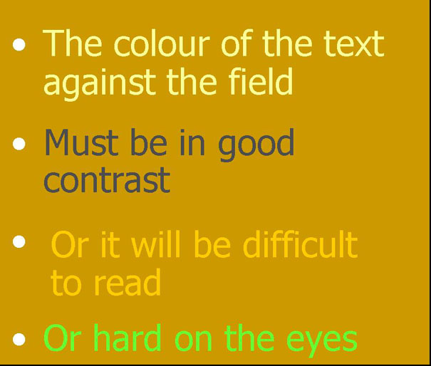
- One way to deal with this situation is to color
block your
sign.
- By reversing the field and text colors in blocks, your viewer’s
eye takes in one message at a time, rather than it all running
together.
- Cautionary & Clearance details
should either be in red
or black on yellow for easy recognition.
- In a situation where you are giving directions to more
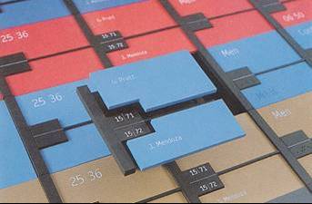
than one destination, it is wise to put each location on
a separate blade. - This will allow for name changes
in the future
without replacing the entire sign.
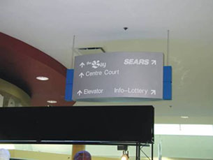
- In a Commercial or Retail situation, use generic terms to direct wayfinding.
- An anchor tenant
such as SEARS would
often be named on a sign.
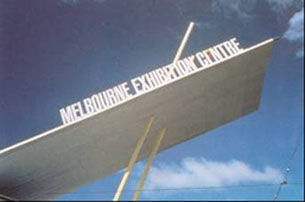
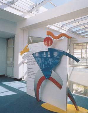
- In the world of Entertainment & Recreation
there is room for
creative design. - This sign on the Melbourne Exhibition Centre
in Australia
seems to take flight and suggests action. - Bright colors, jutting angles and giant
sized signs &
supergraphics, with bold great illustrations give this
building character, making it hard to tell where the graphics
end and the building begins.
- The size of the signs should match that of the building. Seen in context, the giant letters and symbols barely avoid being dwarfed by the building’s scale at the San Jose Arena.
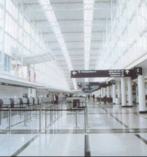
- International
style graphic symbols and size make the soaring architecture of O’Hare
Int’l Terminal 5
with it’s cavernous spaces, intelligible to users from
around the world.
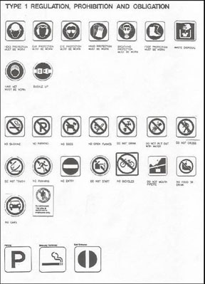
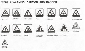
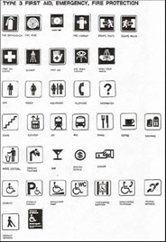
- Use of International
Symbols
promotes easy recognition of
services and destinations. - Supplementing these icons with
simple text when required.

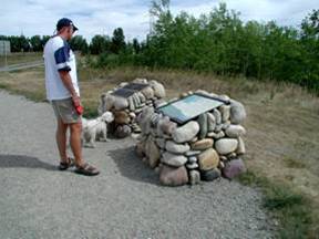
- Use of Wall or Floor graphics
to indicate the
path of choice is a very effective method.

- An impressive, classic style monument serves
as the entrance, ticket booth and sign for Caesar’s
Magical Empire which features “grand scale illusions”
throughout.
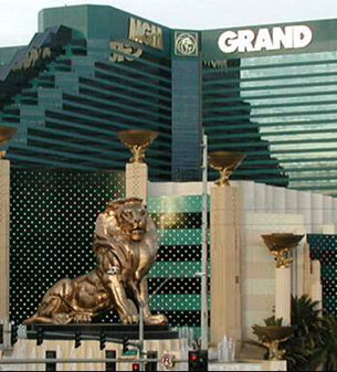
- Las Vegas is a great example of the overlap
between entertainment, architecture, wayfinding and identification.
- Retail is entertainment.
- Entertainment may have an educational component.
- Educational institutions and entertainment
facilities now often incorporate retail.
- This term is used to describe when a company takes a product or service
from the core competency of the business and reflects it in their signage.
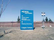
- Nortel Networks in Calgary, Alberta, Canada has succeeded in doing
this right down to the unisex washroom symbols which were cut from discarded
circuit boards and feature toy cell phones that work.
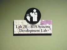
- This sublimated lab sign uses a computer icon and the copy is overlaid
on a map of the Calgary area.
- The theme, or Cultural DNA
created by the facility architect is used throughout the project.
- Sony’s designers created door signs the shape and size of CD
Jewel Cases.
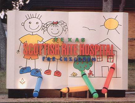
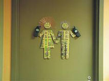
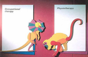
- The Health Care Industry has an opportunity to do this through signs as illustrated by this Hospital in Dallas, Texas.
- Few things are as frightening for children and their parents
as a hospital visit. These bright, 3 dimensional signs in a Sydney Australia Hospital, help create a friendly and welcoming atmosphere.
- The theme is carried out through
the hospital with bright, oversized
figures to add cheer to directional signs.
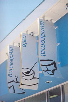
- In addition to wayfinding, signs can also explain
their
product or service. This was creatively handled by the
designers of this Australian Laundry, where you can
have your dry cleaning done while enjoying a coffee.
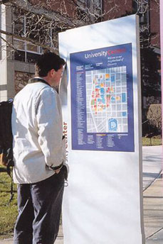
- On a School or Business Campus, use of maps is
often the chosen media. - Keep maps simple and uncrowded with a lot of
detail. - The average person cannot read a detailed map
and
making use of color coding can be a great assistance. - It is important that the orientation of
the map
matches that of the reader’s point of view.
- When dealing with exterior Signs,
durability should always be a factor to consider. The finish must be
able to stand up to the elements, from extreme temperatures to the UV
rays of the sun. A baked enamel
finish or powder coating on aluminum
is the best finish to use.
- Any graphics should be waterproof. Digitally
printed
vinyl is a good product to use. If the sign is behind glass or acrylic, allow for drainage & evaporation, or the condensation could cloud your message. Vandal resistant finishes such as stone & concrete are also a good idea.

- The positioning of the sign has specific requirements
to satisfy ADA rules. If a blind or partially sited
person approaches a room, they know where
to feel for the sign.
- Signs should be installed on the wall beside the door
knob and should sit 60” from the floor to the centre
of the sign message.
- In nursing homes and primary schools this could
be lowered to 48” to suit the users height.
- The sign should be 9” o.c. to the frame of the door.

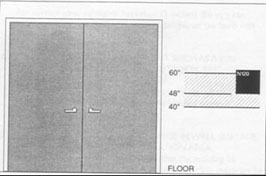
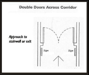
- In the case of double doors, when one is inactive, locate the sign
as though it were a wall.
both doors are active, the
sign must be located far
enough away from the swing
of the door (3 feet) so that
an individual in a wheelchair
will not be hit by the door.

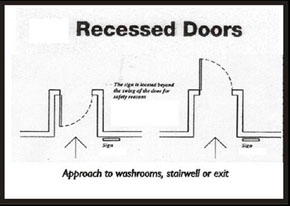
- When the door is in a corner, the sign should be
located far enough out from the swing of the door to
avoid being hit by the door.

- The images presented here illustrate the design solutions, but not the complex analytical processes involved in coming to these conclusions.
- This process of reaching a visual solution to the problem, requires
first identifying and defining the right problem. The creative and analytical
images in this presentation have been taken from a wide variety of books,
sources and presentations and turn substance into image and provide
images with substance.
You have completed “You are Here” WAYFINDING THROUGH SIGNAGE. Now click on image to close the window and begin taking the test.
 |